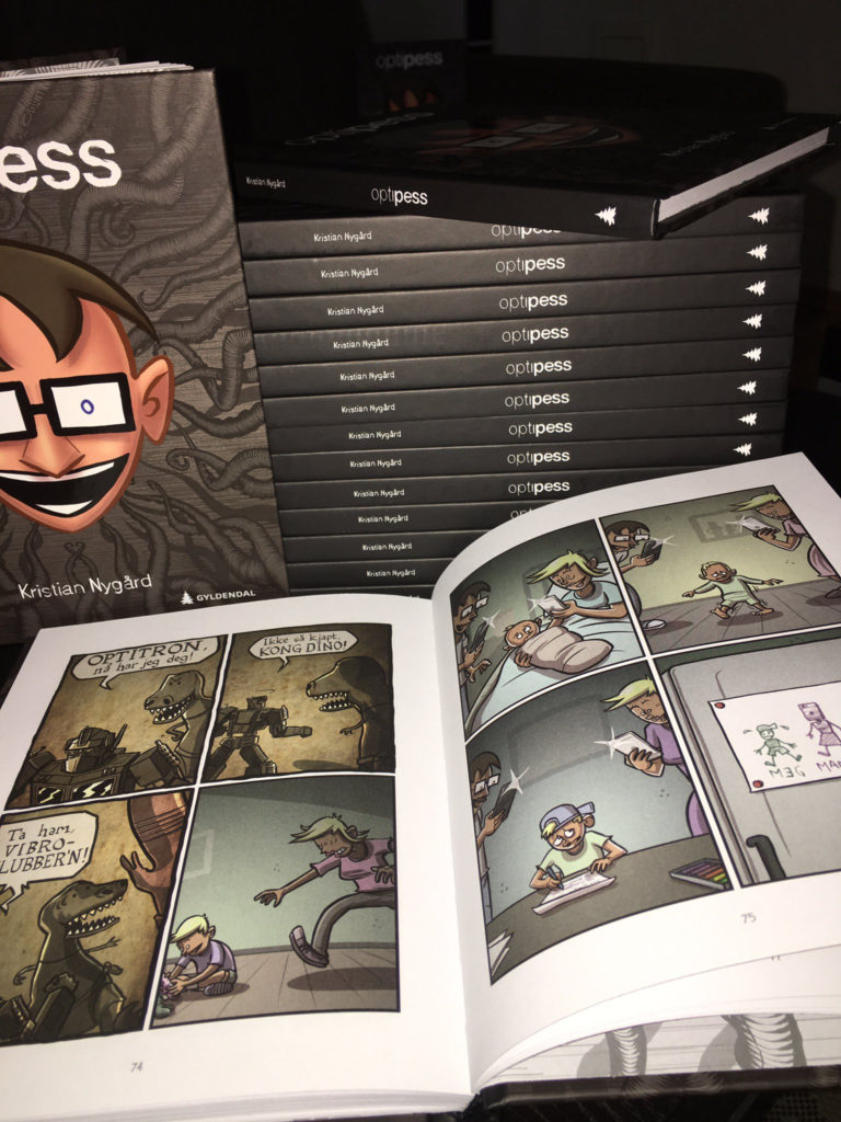
I rediscovered a pile of excess Optipess Christmas postcards I made last year – so I decided to again present a Special Offer for Patreon supporters! By jumping on this offer you’ll get an actual Christmas card (featuring Cthulhu) addressed to you (in the mail!) with a personalized drawing. Here are a bunch of examples from last year – everything from Pikacthu to Metalhead Cthulhu.
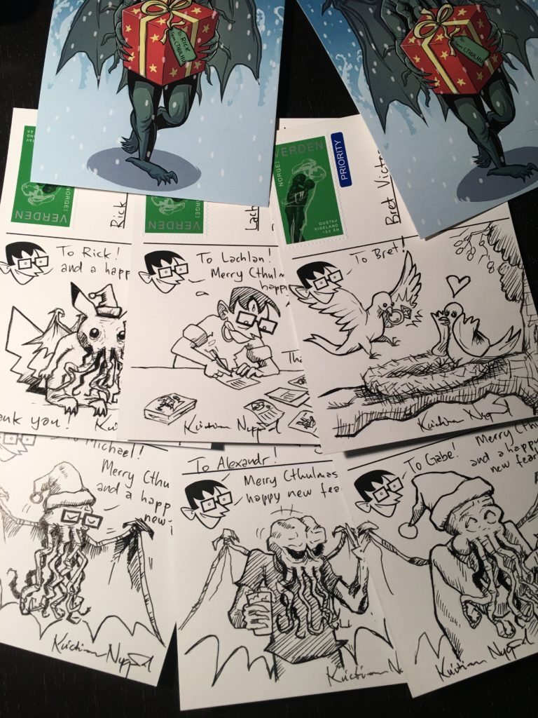
How it works: All patrons who have joined, upgraded or is an active member of the Optipess $5 tier (OR HIGHER) as of November 30 (the end of this offer) will get a Christmas card shipped to their address. As last time around, I will get in touch to figure out what you want drawn on your card, and the cards will be shipped out in the first few days of December – reaching you perfectly in time for the festive Cthulmas.
Thanks for considering joining us on Patreon! The support from my patrons means everything to me, and is a huge reason why I’ve kept Optipess going for over a decade now. Thanks again!