Seeing Red
on June 16, 2025
at 00:00
Behold, here is my latest color theory.
3 Comments

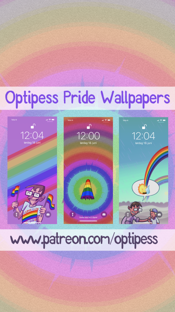
I attended Oslo Comix Expo this past weekend – had a blast (I even danced!), but the consequences were a mild cold and general exhaustion. I’m taking a breather, so no new comic until next week. Still, over at my Patreon I uploaded some new Pride wallpapers with imagery taken from some recent-ish related comics. Here, check out how they will look on your phone – and go here to join the Patreon to get access. Also! There are DOZENS of other wallpapers there. Enjoy!
A little while back I was approached by viral content site Bored Panda with a bunch of interview questions. The site is certainly a bit clickbaity and overly focused on ranked lists of various sorts, but it has quite the impressive reach, so I certainly wouldn’t say no to being featured there.
You can check out the interview here, which is also supplemented by a selection of my comics. Apparently the article has over 170K views, which is good I guess? (I honestly have no idea.) Oh, and this is maybe the third time I’ve been featured by that site, and who knows, maybe/hopefully someone ended up here by wanting to read more Optipess comics. If so, welcome!
Speaking of comics, new ones are coming! In this past week I had a work/life-related thing going on which was pretty stressful (well it’s all relative, but at least for me), and it ended up taking most of my focus for several days. Things are cooling down now though, so I should get around to a bit of drawing.
As you might have noticed, there has been a lack of comic updates over the past couple weeks. The reason is unfortunately that my Dad passed away on the 15th of October after being ill for a long time. We were hoping he’d pull through as he had done a few times before, but alas that wasn’t to be the case this time around. I immediately travelled back home to my Mom and brother, and we’ve been trying to get by as best we can. It’s been a rough time to say the least, and as the funeral is approaching in a couple days it will certainly not get any easier.
But, I’m hoping to get back on my feet within the next week, and maybe even draw a comic. Dad used to read the comic, and while he definitely didn’t get the numerous gaming and tech-related references, he enjoyed keeping up with it. I’m certain he’d want me to keep going, so that’s what I’ll aim to do. It might just take a little while. Thank you for your understanding.
Over at my Patreon I have been sharing a bunch of phone wallpapers made out of Optipess comics, and now I have added wallpapers taken from the recent Cthulhu’s Day Off comic! Here is how they will look on your phone, making it infinitely cooler and way more summery:
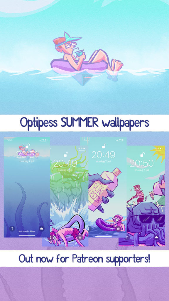
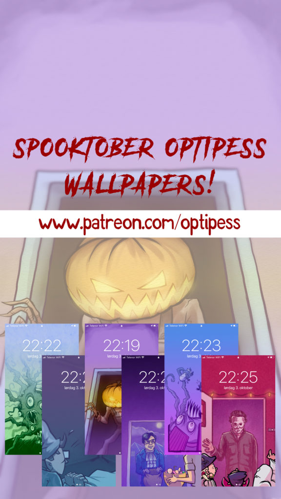
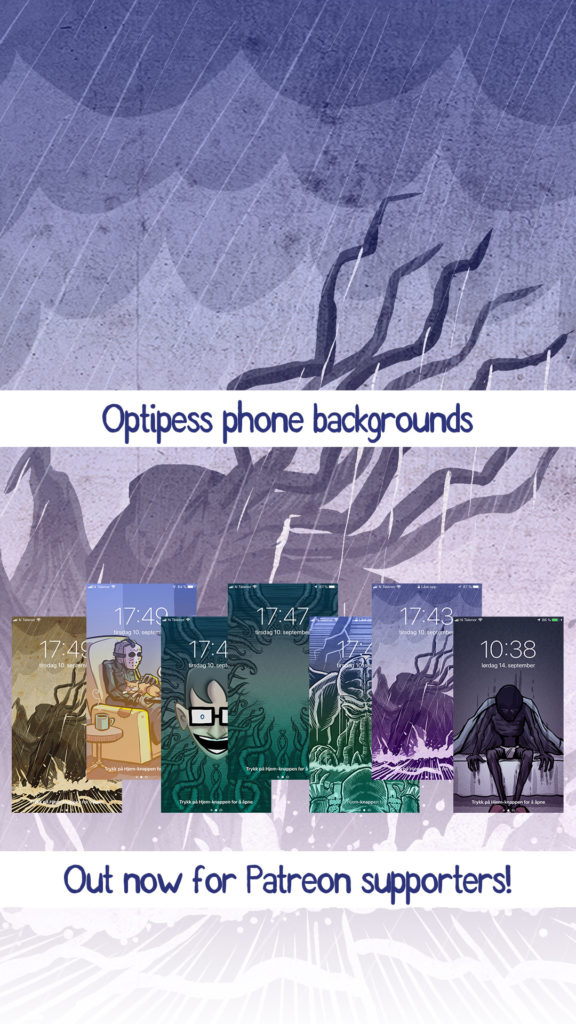
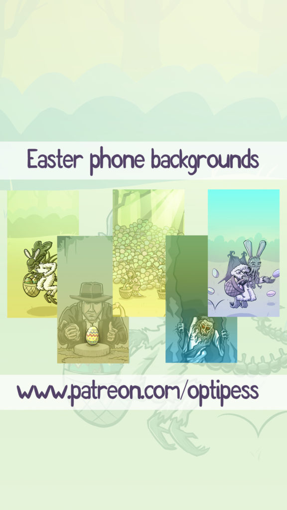
There are now 22 wallpapers in total (also spooktober and easter themed) – available for all supporters of Optipess on Patreon. Keep the comic going AND bling up your phone, it’s a win-win! Go here to join!
Oh also, as a patron, feel free to request a wallpaper if there’s a specific Optipess comic panel you’d like to have on your phone forever and ever. I’ll add it ASAP!
Here’s something I’ve been tinkering with over the past few days. The ability for my Patreon supporters on the $3 tier or higher to remove all the ad banners on this site!
Truth be told, ad revenue on my website has steadily decreased over the years, mostly due to social media taking over, and at this point ads are probably more of an annoyance for the reader rather than an actual source of income for me. Previously when ad revenue was more lucrative, any income I got through ads usually covered the hosting and domain fees for any given year. This isn’t the case anymore, unfortunately. Don’t worry, the site isn’t going anywhere (probably), but I figured it would make more sense to strip the ads away for people who actually financially support Optipess: that is, my lovely Patreon supporters!
There is a new “connect with Patreon” button on the site (placed all the way at the bottom!). Clicking and connecting your Patreon account will remove the ads and instead show a heartfelt thank you-message. Aww!
And even though this feature is for the $3 tier and higher, any and all support from $1 and up on Patreon is of course immensely appreciated. Thank you!


